7 steps to your best presentation
Do you need help creating a good and professional presentation for your prospects?
The Localvest team is here to help you with a couple of tips:
- Keep it simple and to the point
- Choose the right font
- Limit transitions & builds (animation)
- Use high-quality graphics and appropriate charts
- Use color wisely
- Pay attention to the background contrast
- Use high-quality images
1. Keep it simple and to the point
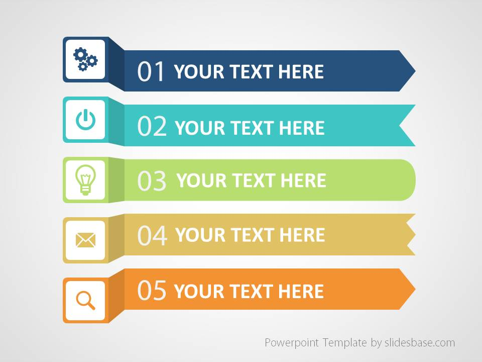
One of the most important things you need to remember is to keep your presentation simple and to the point. Your slides should have plenty of “white space”, and your message should be clear.
A simple, visually appealing slide will engage your audience and keep them on track with your main points.
2. Choose the right font
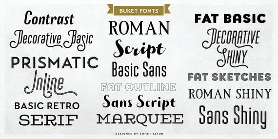
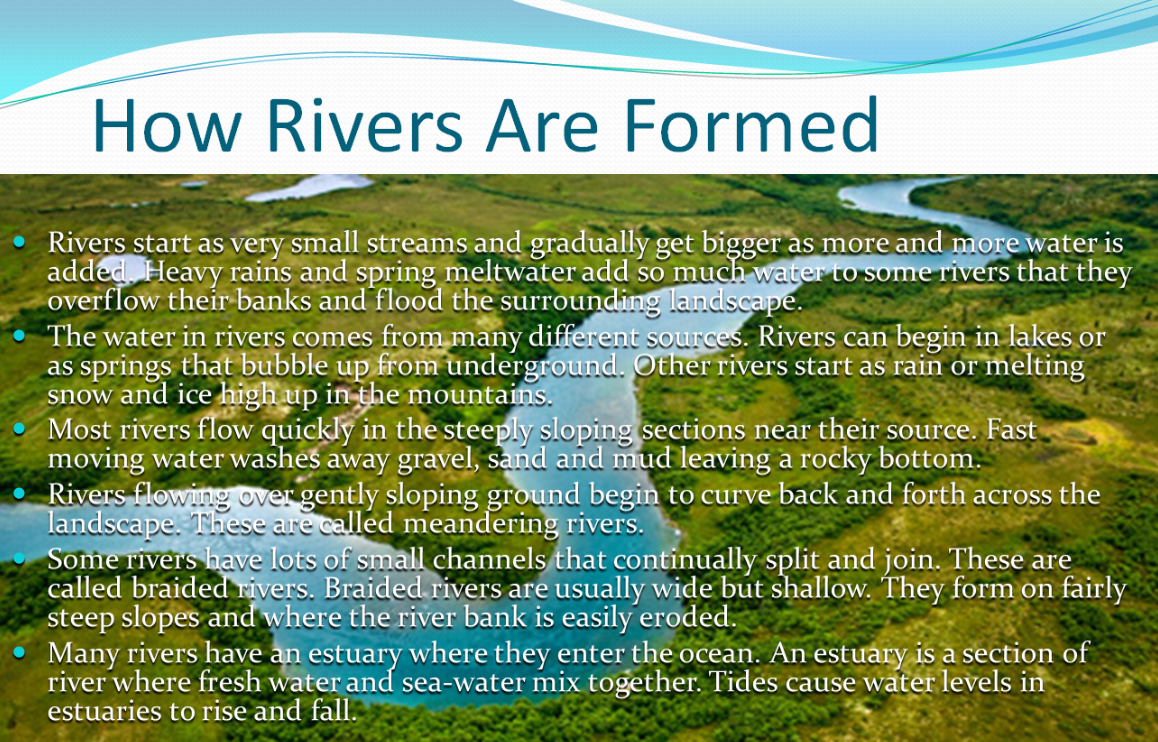
Choosing the right font can make all the difference in your presentation. Having a font that is both clear and easy to read makes it simple for your audience to pay attention to what matters most – your presentation.
3. Limit transitions & builds (animation)
Having too many distractions during your presentation can actually work against you. If your audience is too distracted by looking at your animations instead of the actual content, this can take away from the overall impact of your presentation. Like point 1 above, keeping it simple and elegant works best here.
4. Use high-quality graphics and appropriate charts
If you are showing data on your presentation try to visualize these as much as possible but make sure your design is simple and clean so your audience can easily understand and will not spend too much time trying to decipher what your charts are trying to say.
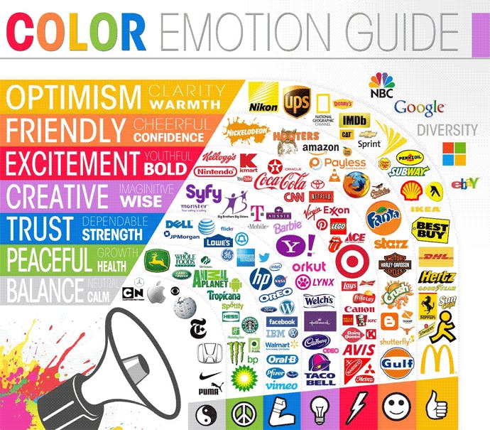
5. Use color wisely
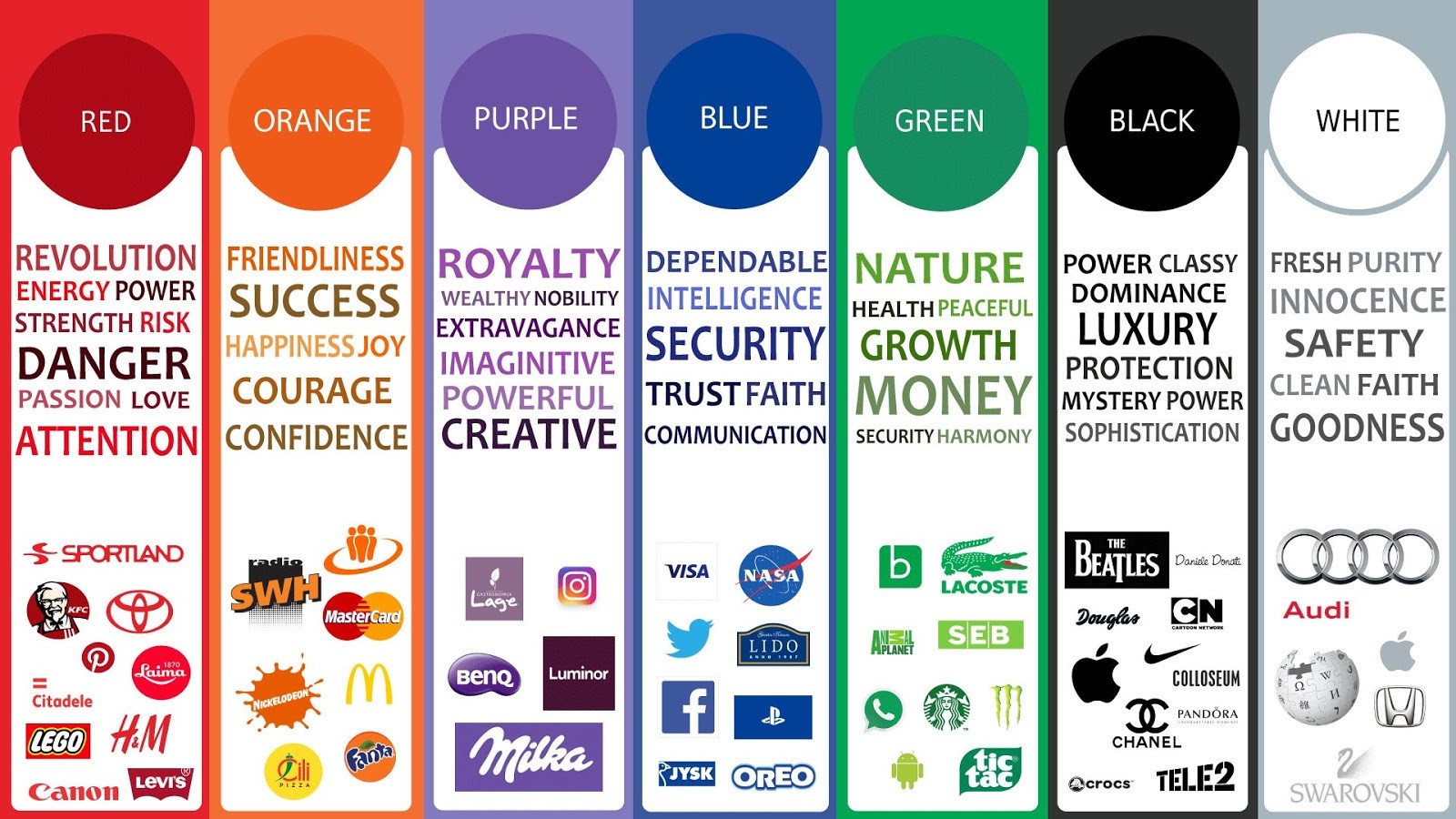
The right color can help you to keep your audience motivated, and improve comprehension and retention. Make sure to use the color that best suits the message you are trying to give.
6. Pay attention to the background contrast
Contrast is really important to make your message clear and easy to visualize. Pay attention to the color you are using in the background and the color you are using on the font to make sure there is a contrast.
7. Use high-quality images
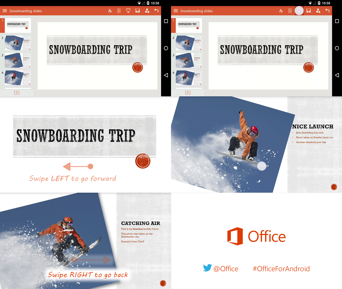
Make your presentation more visually attractive with high-quality images, but do not use images just to decorate. This can become a distraction. Use images to reinforce and complement your message.
Now that you already know the 7 steps, here are some free online tools that can help you make your presentation even better:
Easily create eye-popping infographics
Whether you need to explain a process, show off data, or tell a story, infographics are the perfect tool for the job. Start from a template or create an infographic from scratch. You decide how much control you want.
Video creation for everyone
These video creation tools help you create screencast videos with your screen recorder. It’s fast, free, and easy to use! Capture your screen, add a webcam, and use narration to customize your video.
With Canva, you can easily create beautiful documents & designs for any occasion and purpose. From social media posts to presentations, you can browse more than 65,000 editable templates or you can start from scratch.
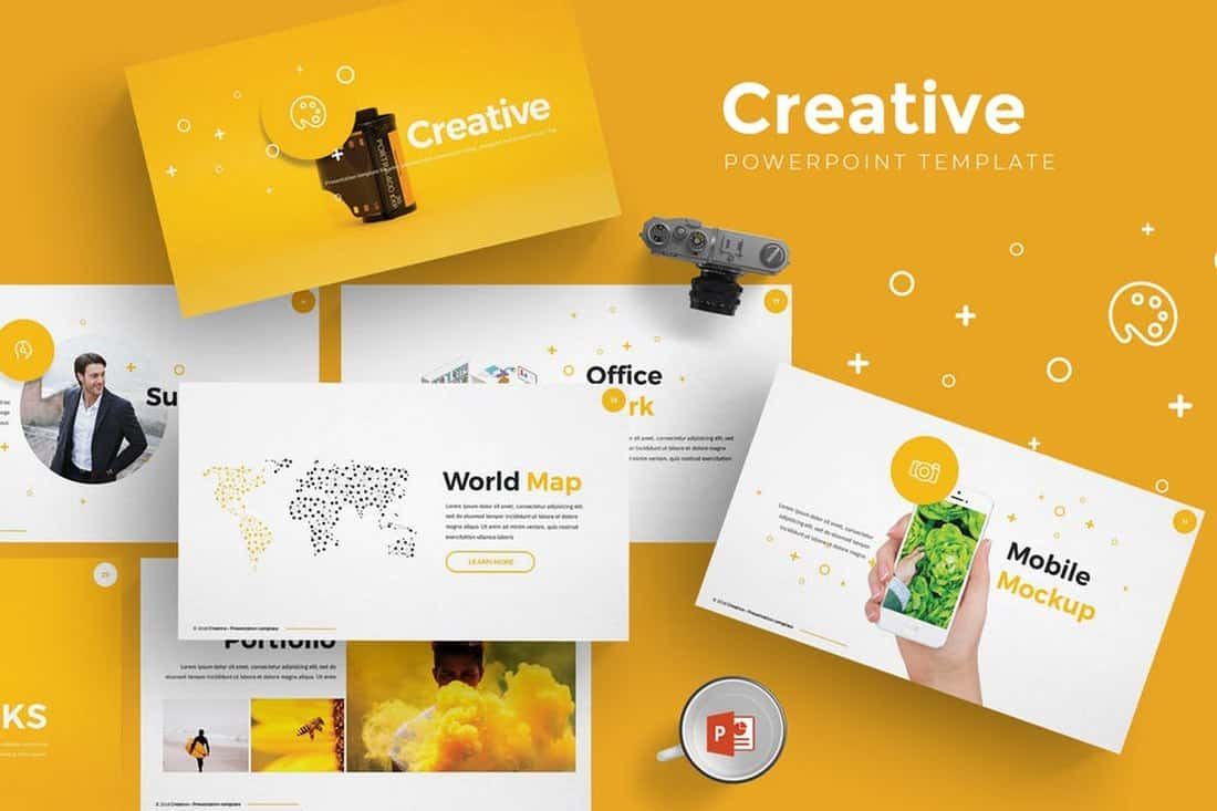
Free presentation templates
Download free PowerPoint templates and Google Slides themes for your presentations. All templates are completely customizable, easy-to-edit, and free for both personal & commercial use. Trust in our professional designs and focus on communicating your ideas.
Beautiful, free images and photos that you can download and use for any project. Better than any royalty free or stock photos.
The Localvest Team.
