In recent conversations with various founders, a recurring topic has been the role of homepages in fundraising efforts. It’s clear that the evolution of web design has significantly transformed since the early days when every site resembled Craigslist—filled with hard-to-read fonts, minimal imagery, and zero aesthetic appeal. We all remember the era of pop-ups, where finding a recipe online involved closing five intrusive windows just to access the content. Following that, we entered the content-heavy era, where homepages became repositories of information, filled with blogs, tabs, and search bars trying to make sense of it all. As Product Growth wisely advises, “Don’t make your homepage your company’s Wikipedia.”
Today, we’ve entered an era of simplicity and minimalism in web design. As a strong proponent of this shift, I believe in keeping messages clear and websites simplified.
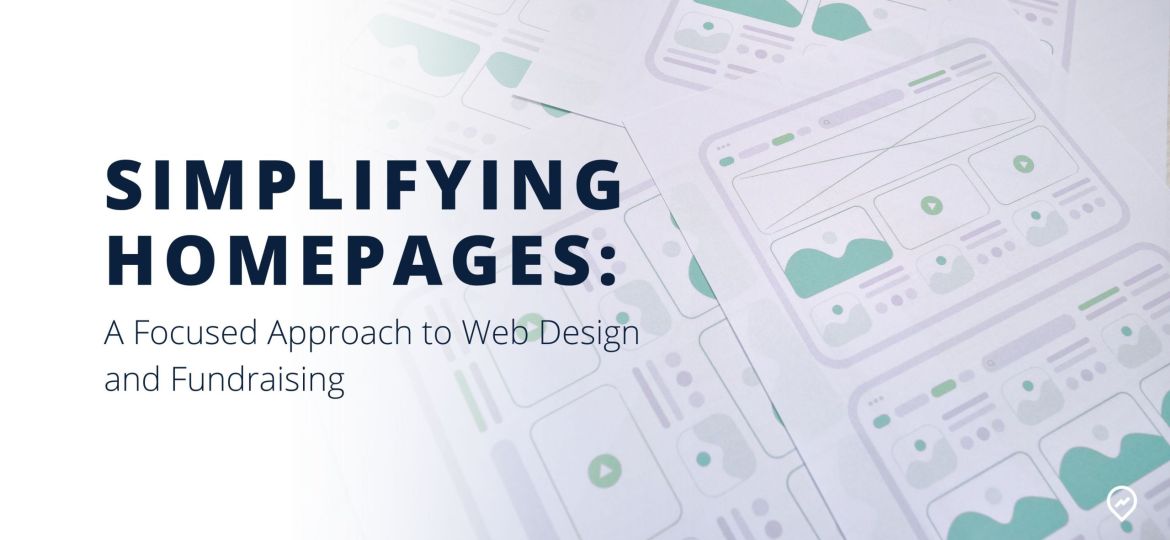
The Era of Simplified Web Design
On LinkedIn, I follow Anthony Pierri from Fletch, a company that excels in creating webpages with this fresh, minimalist style. His insights regularly inspire me to rethink our web design approach.
In one of Anthony’s recent posts, he shared a compelling graphic on how to streamline webpage design effectively:
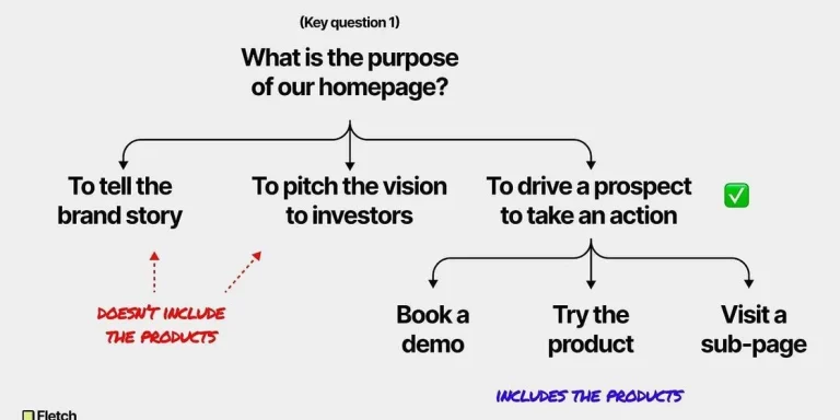
Fletch – Homepage Purpose
To keep your message clear, your website must stay focused. For most businesses, this means guiding potential customers toward making a purchase. Any information not directly aiding this goal should be removed, including content aimed at investors.
Potential investors have distinct needs and questions compared to potential customers. Mixing these messages can confuse both groups. Customers are not interested in your go-to-market strategy or profit margins; they want solutions to their problems at a fair price.
Focused Websites for Different Audiences
This is why it’s crucial to maintain a website focused on potential customers, while using a separate platform to share investment opportunities. Tools like a Localvest deal tile allow you to present information exclusively for potential investors and track interactions to tailor your follow-up messages effectively.
If your current strategy involves mentioning investments on your main website, keep it minimal. A simple Call To Action (CTA) inviting interested parties to reach out for more information is sufficient. For example, an “Invest” link in your webpage footer can lead to a straightforward landing page with a message like, “We have a current investment round open now for accredited investors. Reach out to learn more,” along with a reply email link or a contact form. This approach avoids overwhelming visitors with too much information.
Actionable Steps
Evaluate your current website: Are you addressing potential customers, distributors, supporters, and investors on the same platform? If so, streamline your content. Remove anything that doesn’t directly drive a potential customer toward a purchase. Find alternative spaces for non-customer-focused information.
Resist the urge to be all things to all people. Keep your main page focused on converting potential customers into buyers.
By embracing simplicity and clarity, we can enhance our web presence and drive more effective fundraising efforts.
This approach to web design not only simplifies the user experience but also ensures that each audience receives the most relevant and compelling information. As we continue to innovate and grow, maintaining this focus will be crucial to our success.
Need Help Simplifying Your Homepage?
Let’s work together to make your website a powerful tool for your business. Reach out to learn how we can transform your homepage into a clean, customer-focused experience.